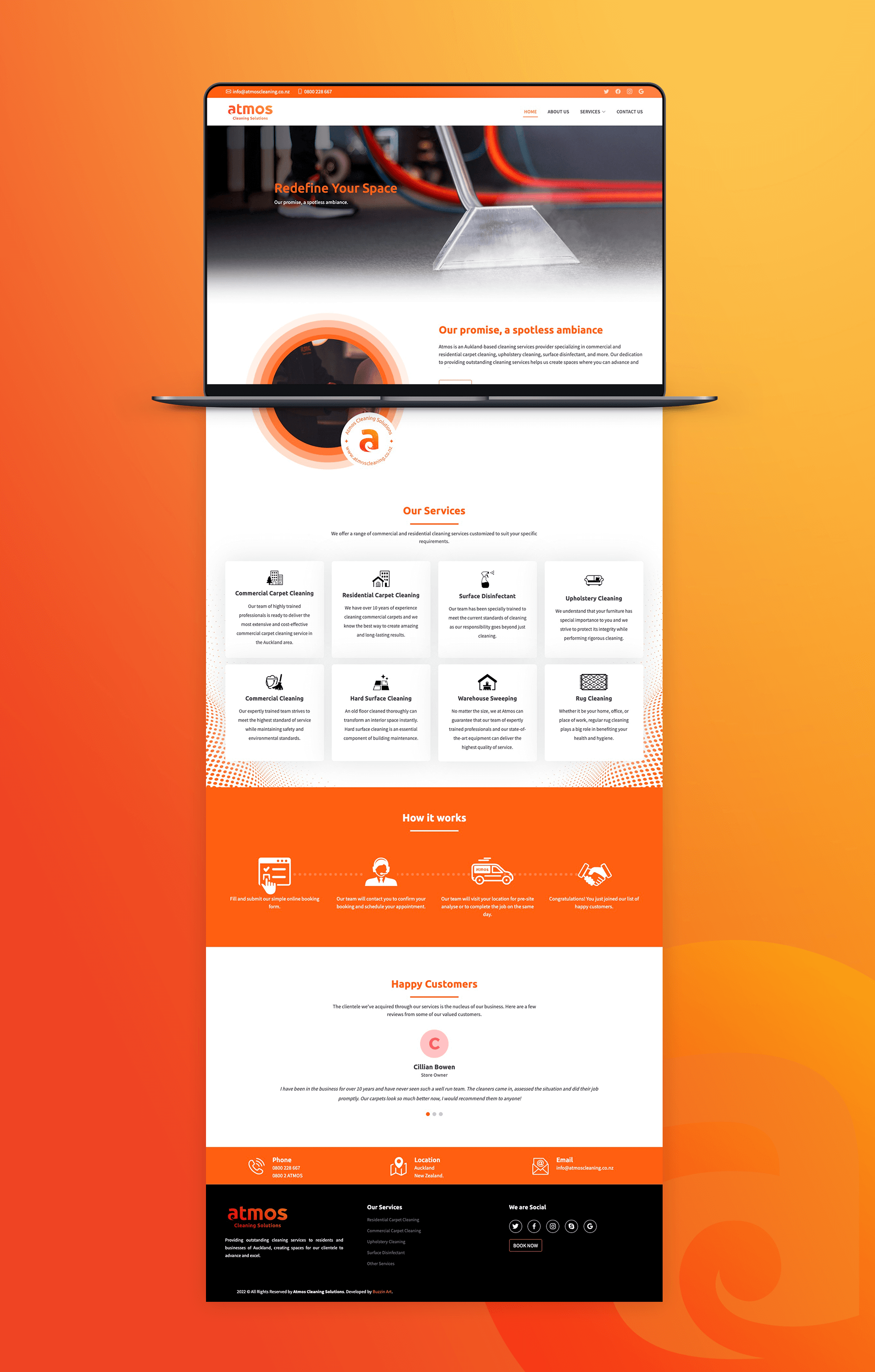
Atmos is a cleaning and air conditioning solutions provider in Auckland, New Zealand. They have been operating in Auckland for over 7 years under the hood and finally decided to refresh their brand identity and come to the real competition in the market.
The owner wanted their brand to represent the New Zealand identity and be more appealing to the local audience. He was also looking for something unique and minimal in design.
My Approach
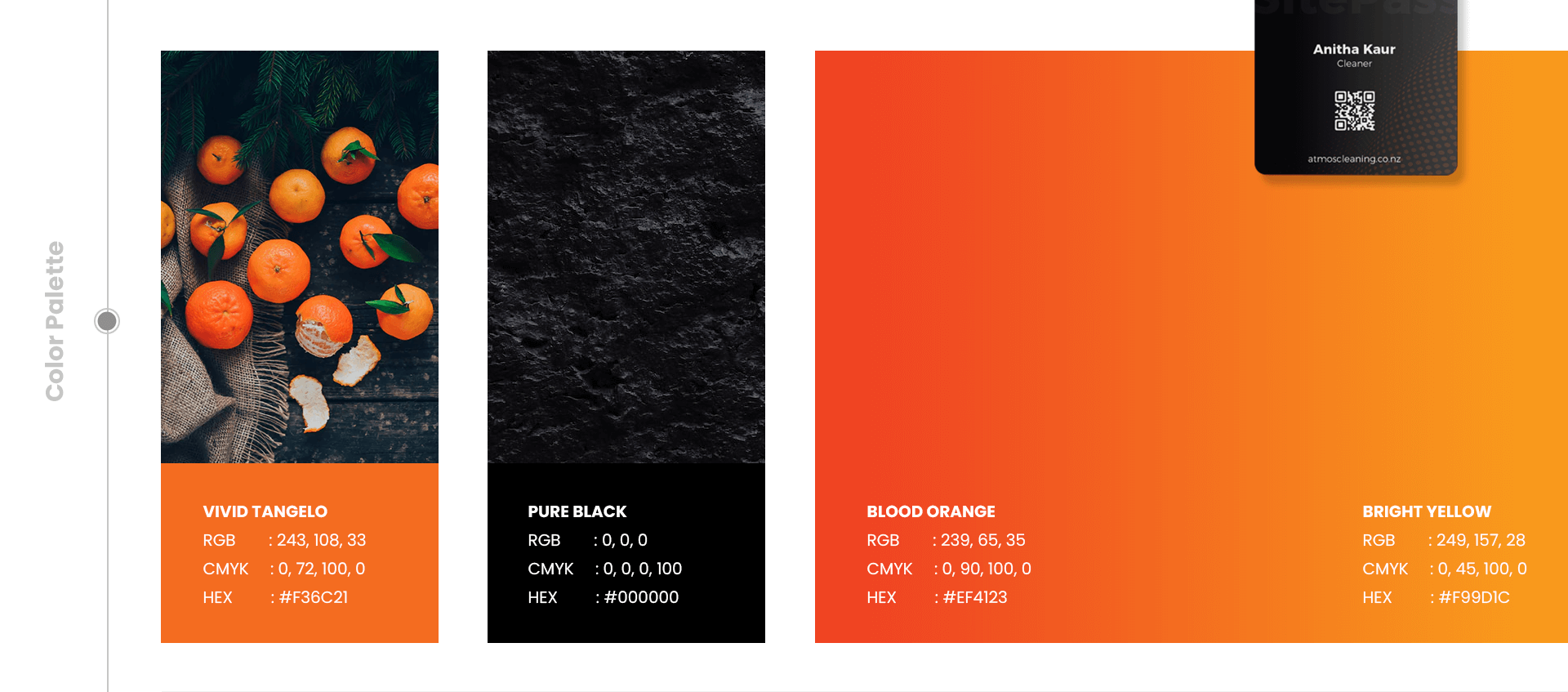
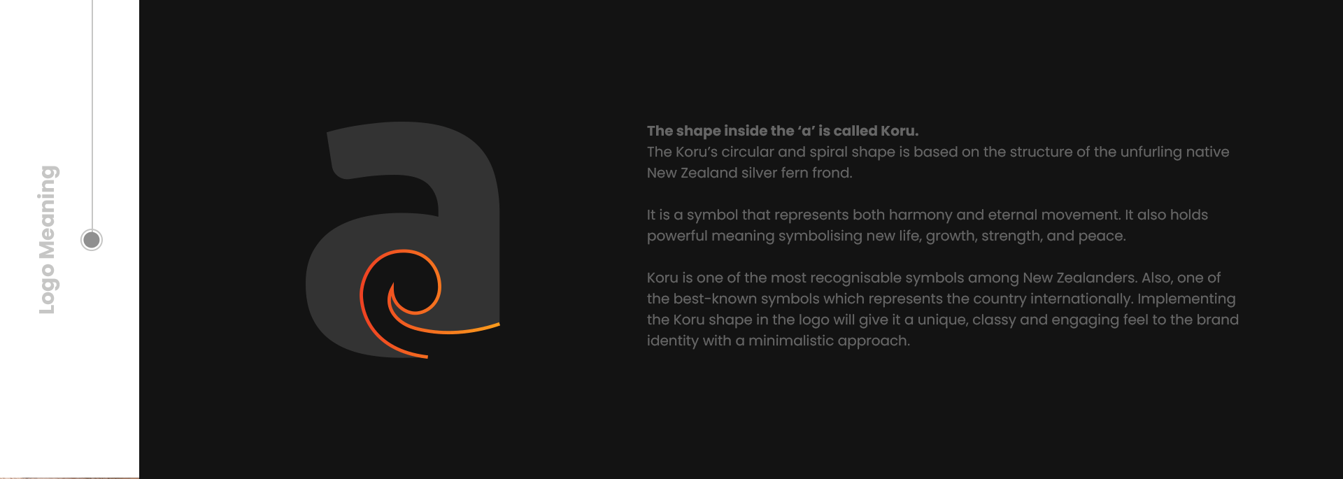
I had a face to face meeting with the owner to understand his vision more clearly for the brand. Even though he didn't have a clear image for the logo initially, I was able to get everything I needed by asking some questions related to his business. The owner came up with the Orange color for the logo and I agreed with him as it is a bold and unique approach for a cleaning company not only in New Zealand but in the global market as well.
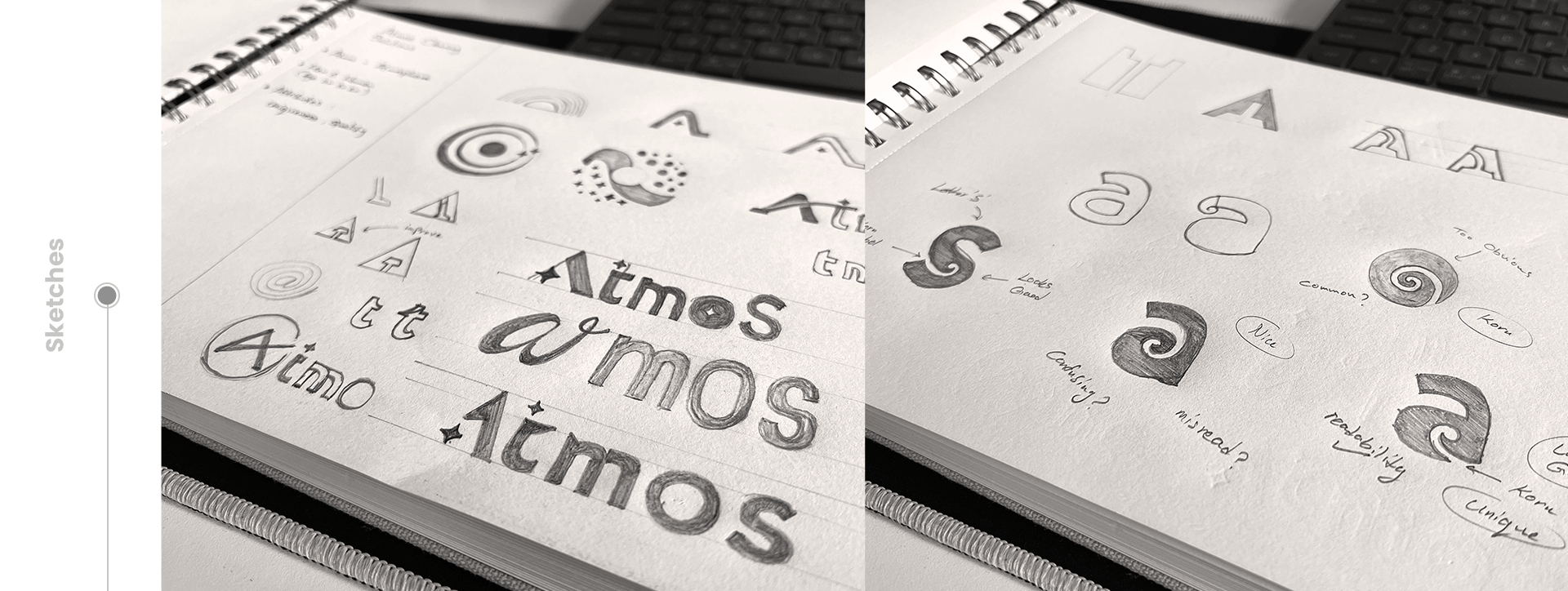
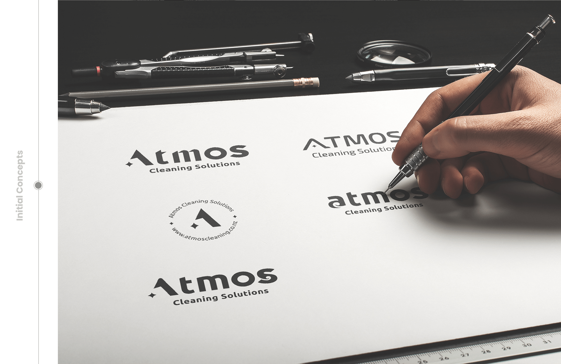
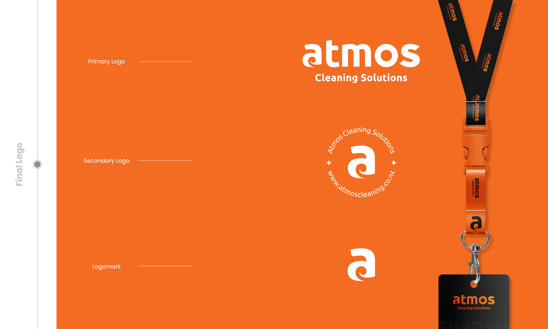
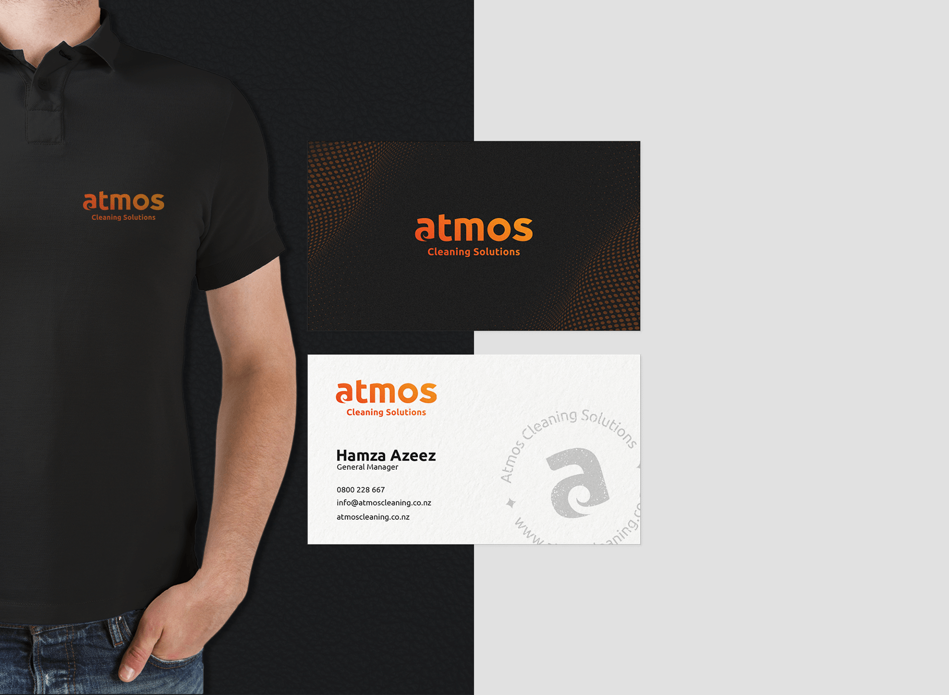
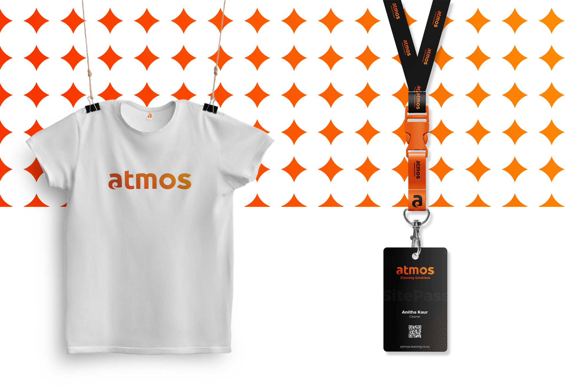
After the discovery session, I started my initial brand research and try to make some solid concepts by sketching everything that comes to my mind. After a few days, I was able to give him 3 initial logo concepts and he decided to go with one of the concepts. After some refines and tweaks I have completed the final logo for the Atmos brand which can reflect their unique identity among New Zealand businesses.